Most projects treat accessibility as a list of bugs to close. Close #215,
close #239, move on. What actually happened in this repo between
2026-08-28 and 2026-09-01 looks like that at first — nine issues, nine
fixes — but it didn't stop there. It ended with a document
(docs/accessibility.md) that states, in writing, exactly what's
guaranteed, and a test that turns one of those guarantees into something
CI enforces on every pull request, for every diagram type, including ones
that don't exist yet. That last part is the actual point of this post: the
difference between "we fixed the bugs we found" and "we built something
that keeps finding them for us."
The bug that started it: an SVG with no name
#215, closed
2026-08-28, found that every SVG this library renders came out of
svgOpenTag() with no role, no aria-label, and no root <title> —
verified directly against a rendered sample, not asserted from a spec
reading. To a screen reader, a flowchart wasn't a diagram with a
description; it was an anonymous blob of nested text nodes, indistinguishable
from decoration. PRs #234 and #235 fixed it by giving the root <svg> a
role="img" and, when the caller supplies one, an aria-labelledby
pointing at a real <title> element.
There's no screenshot for this one, and that's the point: a sighted reader
sees the identical diagram before and after. The entire fix lives in
markup nobody looks at. Here's the actual root tag renderMermaidSVG
emits for the same three-node flowchart, rendered through the pre-fix tree
(the commit before 3c3b04f) and through current main — namespace and
geometry attributes elided, everything else verbatim:
<!-- before -->
<svg xmlns="…" viewBox="…" width="…" height="…"
     style="--bg:#FFFFFF;--fg:#27272A;background:var(--bg)">

<!-- after — renderMermaidSVG(source) -->
<svg xmlns="…" viewBox="…" width="…" height="…"
     role="img"
     style="--bg:#FFFFFF;--fg:#27272A;background:var(--bg)">

<!-- after — renderMermaidSVG(source, { title: 'Release readiness loop' }) -->
<svg xmlns="…" viewBox="…" width="…" height="…"
     role="img" aria-labelledby="zm-title-1"
     style="--bg:#FFFFFF;--fg:#27272A;background:var(--bg)">
  <title id="zm-title-1">Release readiness loop</title>
The middle case is the one worth noticing. No title supplied means
role="img" and nothing else — no fabricated "flowchart with three nodes"
summary. That's deliberate: an unnamed image is an honest unnamed image,
and a generated name would be worse than none, because it would look like
someone had thought about it.
#239, closed the
same day, is the more interesting bug, because it's what happens when two
correct-in-isolation fixes meet each other for the first time. role="img"
tells assistive tech "don't descend into this, treat it as one image" —
correct, for a diagram with no interactive parts. But a click A "url"
directive (added earlier, in #208) renders a real, focusable <a href>
nested inside that same SVG. Slap role="img" on the root and a
keyboard user can still Tab onto that link — it's visually present and
still in the tab order — while a screen reader user is told there's
nothing here to explore. Worse for the decorative: true case:
WAI-ARIA is explicit that aria-hidden="true" must never sit on an
ancestor of a focusable element, and this code did exactly that. PR #248
fixed it by making the presence of a real interactive link override both
role="img" and aria-hidden — a diagram containing an actual action is
never allowed to look, to assistive tech, like it contains no actions.
A four-day sweep, not two isolated bugs
Two days later, on 2026-08-30, a broader design review turned up five
more issues in one pass, all closed the same day: contrast failures on the
description text (2.85:1 in the default theme, 4.02:1 in
Dracula — #278)
and on the Edit link (1.94:1 default, 2.65:1 Dracula, the least
legible text on the page and also the entry point to the site's core
feature — #279);
an edit dialog with no role="dialog", no aria-modal, and a close
button whose only accessible content was the literal character "×"
(#280); a theme
picker button that opened a dropdown without exposing aria-expanded,
inconsistent with a sidebar toggle elsewhere in the same codebase that
already got this right
(#281); and no
skip-to-content link, forcing a keyboard user through the full nav and
sidebar on every page load
(#282).
#283, also closed
that day via PR #316, added one consistent accent-colored focus-visible
ring across every interactive control, replacing whatever each browser's
default outline happened to look like.
#285, closed the
next day, fixed undersized touch targets on mobile.
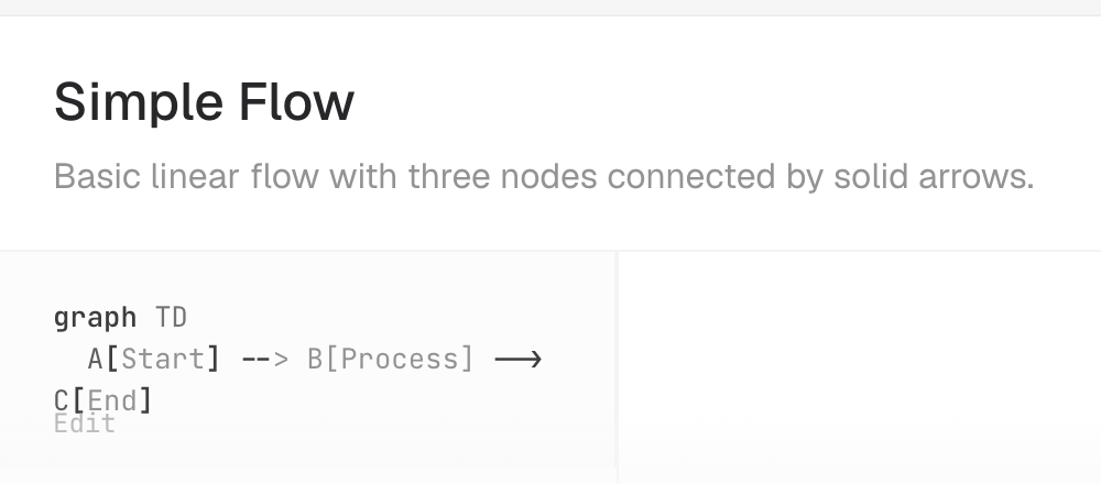
Two of those are worth actually looking at, because contrast numbers don't
land the way pixels do. This is one sample card on the demo site's home
page, rendered from main immediately before the description-contrast fix
merged and again immediately after the Edit-link fix merged — the only
difference between the two builds is demo/styles.css:
| Before (#278, #279 open) | After |
|---|---|
 |
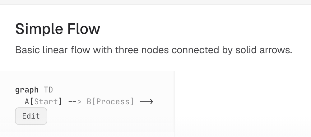 |
The description text is the easy one to argue about — grey-on-white body copy looks fine to most people, which is exactly why it survived that long. The Edit link is not arguable. It's the entry point to the site's core feature and, in the "before" build, it's a ghost. Note also that #279's fix wasn't just "darken the text": the control was promoted to a bordered button, so it reads as interactive without depending on color at all.
That's a lot of individually small fixes. None of them, on their own, would be worth a blog post. What makes them worth revisiting together is what happened next.
#294: turning a pattern into a guarantee
#294, filed 2026-08-29 and closed 2026-09-01, is explicit about why it exists: this work was "already live in this codebase... but it's invisible as a positioning point. No Mermaid renderer currently markets accessibility as a feature." The proposal was two things bundled together on purpose — a written statement of what's actually guaranteed, and a CI check that fails the build if the guarantee stops being true.
The result is docs/accessibility.md, and it's worth reading for what it
refuses to claim as much as for what it claims. It does not say
zombie-mermaid conforms to WCAG at any level. It says one specific,
checkable thing: every SVG this library renders, for every diagram type it
supports, with or without a click-based link, with or without a title,
follows a documented table of role/aria-hidden/aria-labelledby
outcomes — and names the exact file that enforces it,
src/__tests__/svg-accessible-name-conformance.test.ts.
That test file is the actual mechanism, and it's built to survive the
document going stale, not just to pass today. Its sample map,
SAMPLE_BY_TYPE, is typed Record<DiagramType, string> — one minimal,
real, renderable Mermaid sample per diagram type. DiagramType is a
closed TypeScript union (src/diagram-type.ts), so a sixth diagram type
added without a matching sample doesn't just leave a gap in test
coverage — it fails tsc --noEmit, which is pnpm run typecheck, which
CI already runs on every pull request via .github/workflows/ci.yml's
test job (alongside pnpm run test:coverage, which is what actually
executes the accessibility assertions). Someone who adds xychart-beta
support in six months and forgets accessibility entirely still can't merge
without either adding a sample or watching the build turn red. That's the
difference between "we remembered to test this" and "the compiler
remembers for us."
The claim made it into the README as a headline feature, not a footnote
buried in docs: "Accessible SVG output, CI-enforced — every diagram
type always gets a role-correct, nameable root <svg>." And the
conformance statement is equally clear about the boundary of that claim.
The demo site's keyboard and focus behavior — the skip link, the dialog
semantics, the disclosure widget's aria-expanded — is documented as
implemented, each one landed as its own targeted PR, each one read
directly from current source as part of writing the statement. But it is
explicitly marked as not automated: no axe-core or pa11y run in CI
against the demo site, no automated keyboard-navigation test. The document
says outright that a demo-site accessibility check "is a reasonable
follow-up, not something this statement claims already exists." That
distinction — CI-enforced for the library's SVG output, implemented but
manually verified for the demo site — is the part that turns out to matter
just hours later.
#325: the regression that landed in the gap
#325 is a
follow-up finding on PR #316 — the same PR that shipped #283's focus-visible
ring, filed 23 minutes after that PR was opened, while it was still under
review and being visually verified rather than after the fact. The new
ring applied correctly almost everywhere, but on the sample sidebar's
plain links, .sidebar-list li carried overflow: hidden (plus a
text-overflow: ellipsis that had never done anything, because no
white-space: nowrap was ever paired with it), and the ring's outline
property draws outside the link's border box. So a rule that was truncating
exactly nothing clipped the ring down to a single vertical tick. Confirmed
by computed-style inspection, not guesswork: the outline itself was
correctly 2px solid in the theme accent; its immediate <li> ancestor
was what clipped it. A keyboard user tabbing through the sample sidebar got
little to no visible focus indication — the exact gap #283 had just closed
everywhere else, relocated to one specific control.
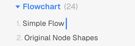
This one is worth a picture, because "almost invisible" is a claim a
screenshot can settle. Both frames are the real built demo site, tabbed
into with actual Tab keypresses, built from the fix commit and from its
parent:
| Before (#325 open) | After |
|---|---|
 |
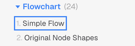 |
Worth flagging, since this post is otherwise about being precise: #325's
own write-up says the surviving sliver was on the left edge. Rendering
both builds says otherwise — the <li> starts at the link's left edge and
runs well past its right, so the left and top strokes are the ones that get
clipped away and the right stroke is the one that survives. The bug was
real and the diagnosis of the cause was right; the direction in the issue
text was not, and nobody caught it because prose describing a screenshot is
not a screenshot.
The fix, PR #377, merged 2026-09-01 at 23:30 UTC — about eight hours after PR #373 merged the conformance statement and CI check at 15:44 that same day. The regression itself had been sitting open since it was caught during #316's own review, the day before; what changed on 2026-09-01 was that the guarantee this project had just finished writing down went live hours before the last loose end from the PR that inspired it got tied off.
That sequencing is worth sitting with rather than glossing over. The sidebar focus ring is demo-site behavior — exactly the category the conformance statement had, hours earlier, explicitly declined to claim was covered by an automated check. Nothing in CI would have caught #325; it was caught the same way #280 and #281 were, by someone actually looking. That's not an embarrassing footnote to the "we shipped a CI gate" story. It's the honest version of it: the gate covers what it says it covers — SVG accessible names, and only that, checked automatically on every diff — and everything outside that boundary still depends on a human deciding to look again, the same day the guarantee document says so in writing.
What actually changed
Compare the two failure modes. Before #294, "is zombie-mermaid's SVG output accessible" was a question you could only answer by reading recent issue history and hoping nothing regressed since the last person checked. After it, the answer is: read one document, and if you don't trust the document, read one test file, and if you don't trust the test file, break something and watch CI turn red. The library's accessible-name guarantee moved from "true right now, as far as anyone's checked" to "provably true on every commit, because a closed union and a coverage gate won't let it be otherwise."
The demo site didn't get that same upgrade, and the document says so instead of pretending otherwise. #325 landing in exactly that gap, on exactly the same day the CI gate shipped, isn't proof the gate doesn't work — it's proof the gate is honest about its own edges. The next reasonable step, the document already names for itself: an automated accessibility check for the demo site, so the next sidebar-ring-shaped bug gets caught by a build failure instead of depending on someone doing visual verification on the right PR at the right moment.